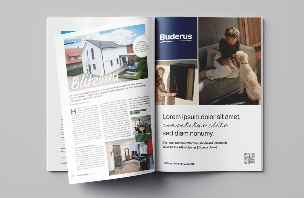
Buderus is a globally active heating technology brand with a strong heritage in engineering and system expertise. The existing design, however, felt too rigid, impersonal and not flexible enough for today’s digital touchpoints.
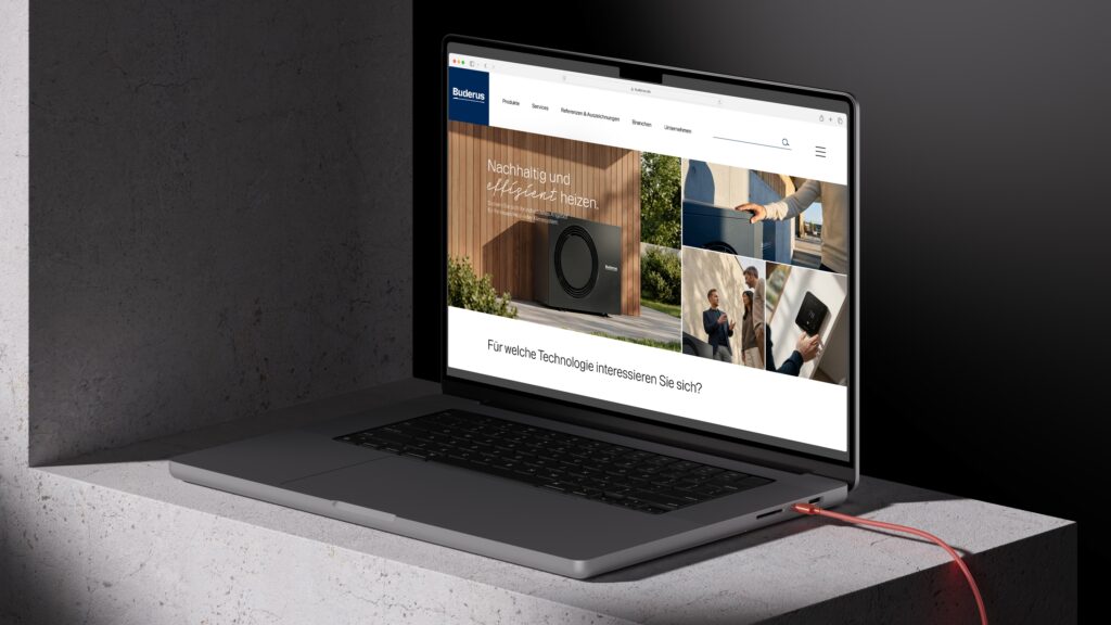
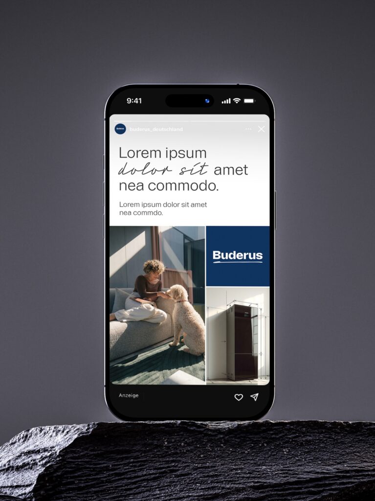
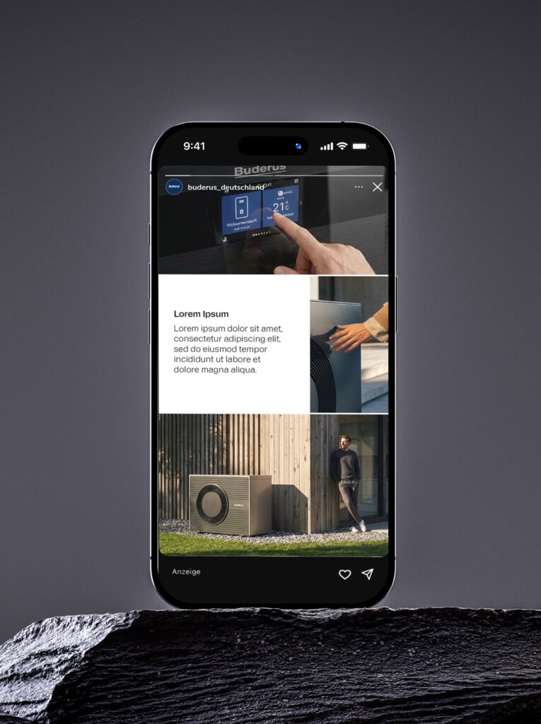
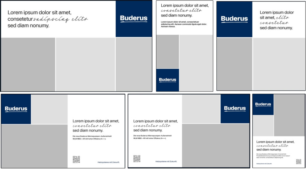
We created a new visual direction that connects premium engineering with a more personal and human brand feeling. A warmer image world, a flexible layout system based on the Buderus logo square and subtle handwritten details helped translate system expertise into a design language that feels clearer, closer and more alive.
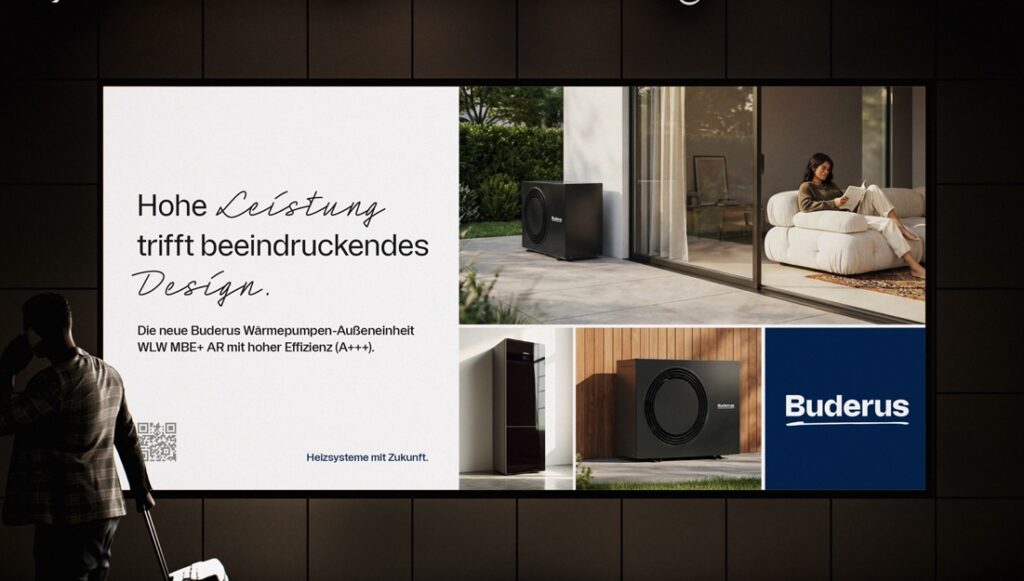
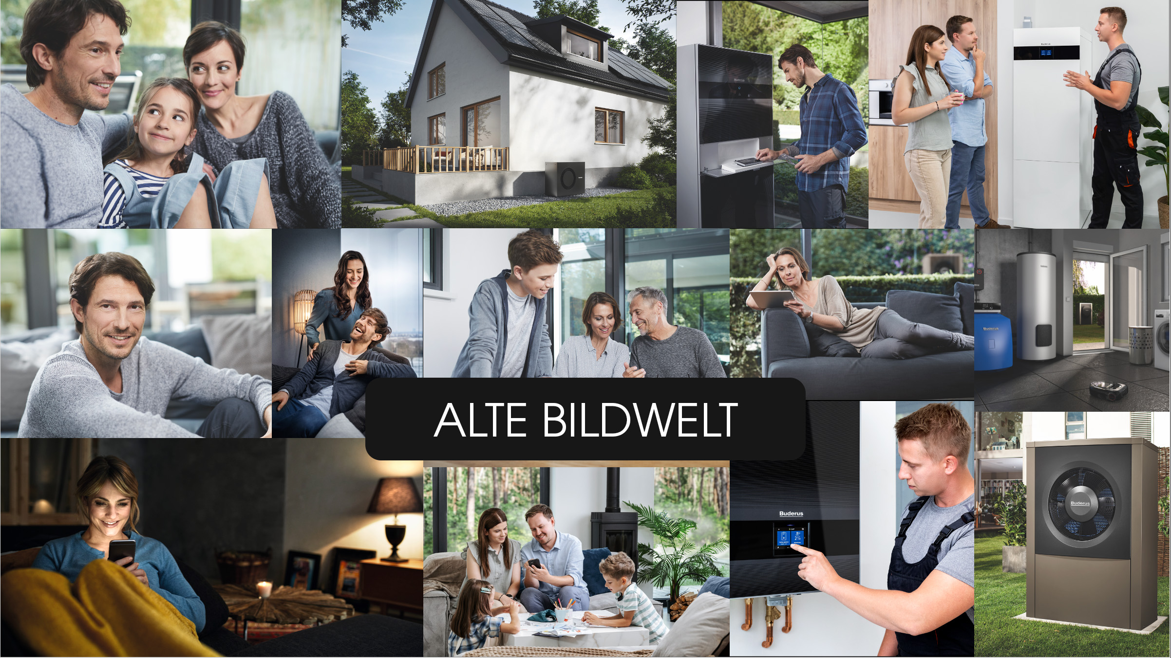
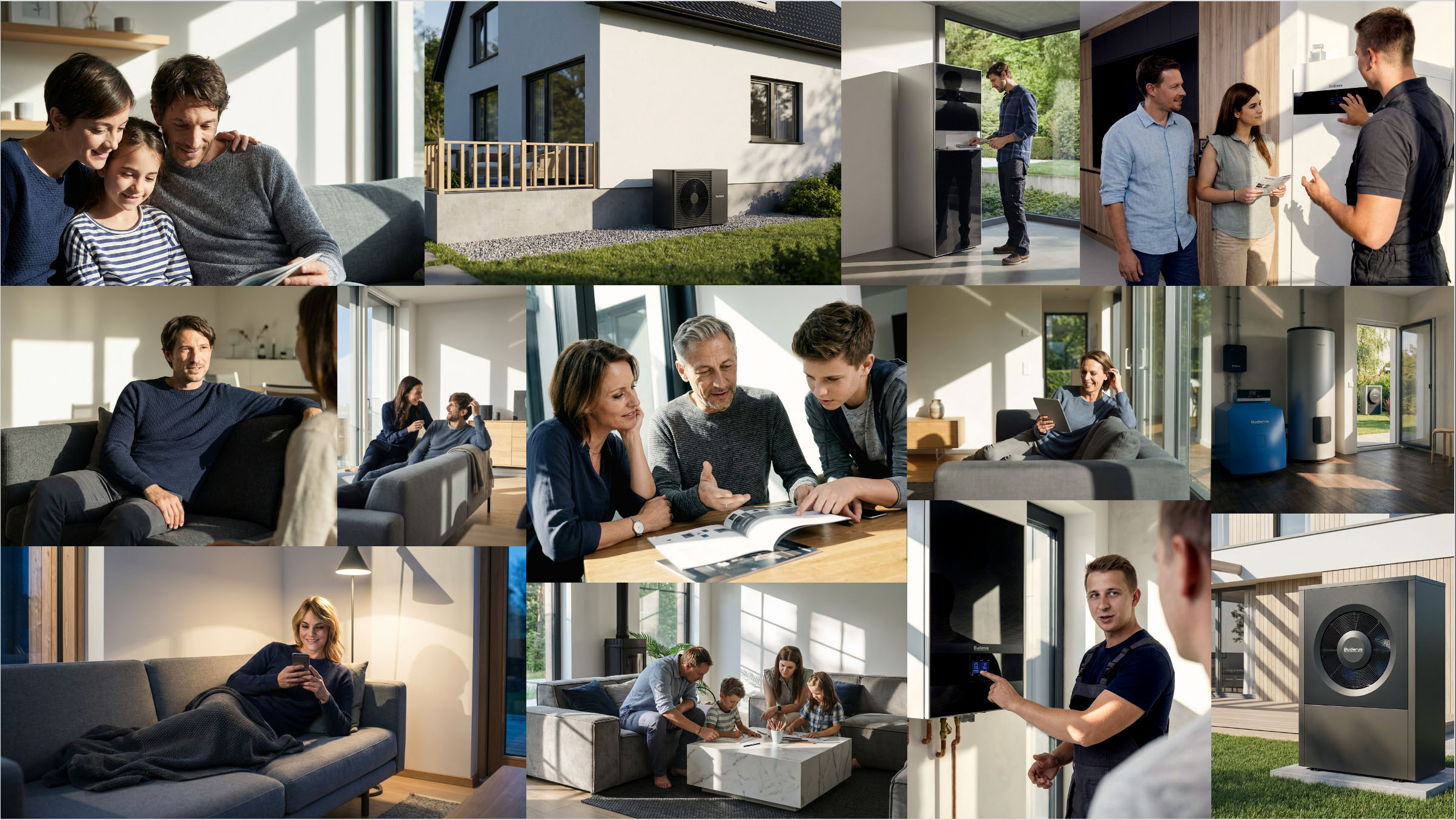
The Image World
The new image world moves away from cold, staged product photography towards warmer and more believable moments. Natural light, lived-in interiors, dynamic angles and snapshot-like situations help the brand feel closer to real people and real homes.
Products are still shown with a premium and technical quality, but they are placed in more human contexts. The goal was to create imagery that feels competent and high-end, while still being personal, warm and approachable.
The Result:
The new design direction gives Buderus a more distinctive and flexible brand presence. The warmer image world makes the brand feel more personal and approachable, while the modular layout system creates consistency across very different touchpoints.
By combining technical precision with a human touch, the design makes Buderus feel more premium, more connected and easier to recognise.
Project Note: The proposed design system was well received, but not fully implemented due to budget reasons. The new image direction, however, was taken forward.
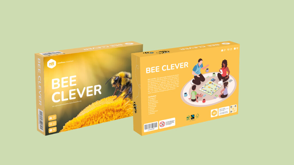
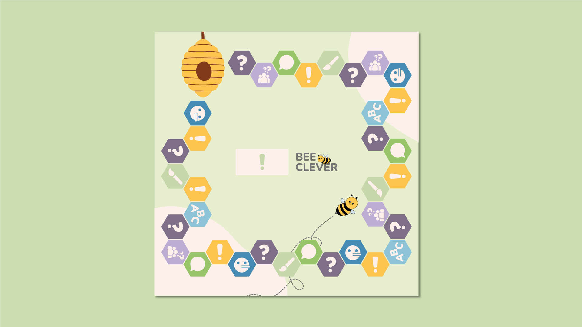
Bee Clever
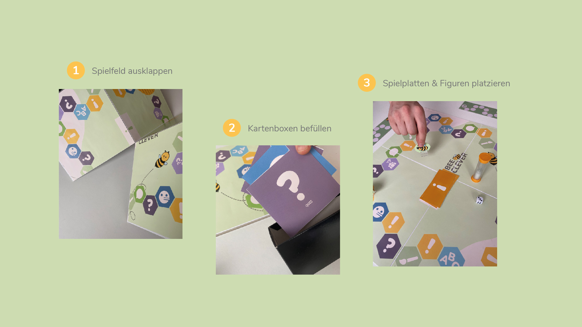
nearBees connects people with regional beekeepers and sells honey from their own neighbourhood. To bring this idea into people’s homes, we developed bee Clever, a board game concept that turns bee knowledge, local honey and family time into a playful brand experience. Built around a set of friendly bee illustrations, the game makes learning about bees feel light, funny and approachable.
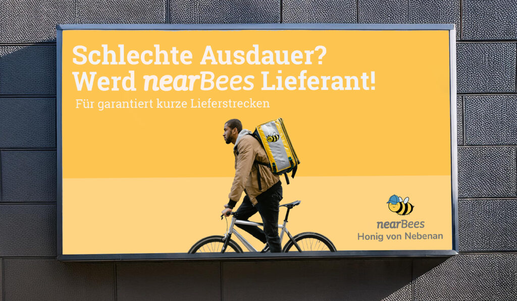
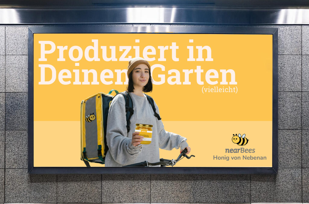
The concept was extended into a 360-degree awareness campaign under the line “Honey from next door”, combining OOH, social media, supermarket activations and local digital ads.
The Idea
nearBees is all about proximity: honey from local beekeepers, delivered from your own neighbourhood. The board game translates this idea into a format that can enter one of the most personal spaces of all: the family table.
Instead of being just another promotional gift, bee Clever gives people a reason to spend time with the brand. Fun facts, quiz moments and playful tactics help families learn more about bees, regional honey and why both are worth protecting.
The goal
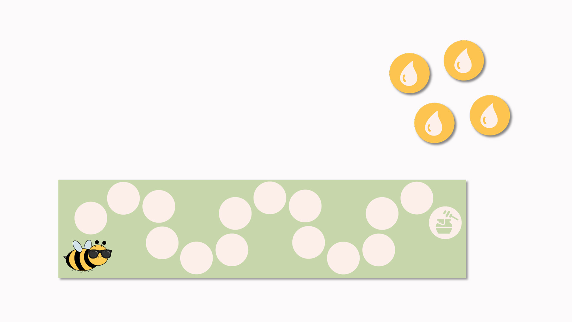
– Collect nectar (in the form of small stones) – Get into the beehive – Be the first
Duration and repetition
– Approx. 90 min – Can be played several times
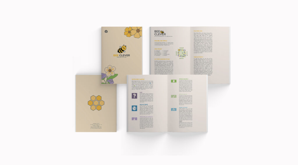
The Illustration System
The visual world of the game is built around a cast of friendly bee characters. Their soft shapes, warm expressions and playful details make the topic of bees feel approachable, while giving the game a distinctive and memorable look.
For the campaign, the illustration style becomes more graphic and is combined with real photography. This creates a bridge between the playful world of the game and the real everyday places where people encounter honey, from breakfast tables to supermarket entrances.
Honey from next door - The campaign
A board game alone is not enough if nobody knows it exists. That is why bee Clever was designed as part of a wider awareness campaign under the line “Honey from next door”. The campaign focuses on the idea of proximity and translates it differently across each channel. OOH brings the line into public space, local social ads create playful moments around neighbourhood honey, and supermarket activations meet people exactly where they already think about food. The tone is funny, approachable and slightly cheeky, supported by comic-like elements, bold typography and the bee illustrations.
Concept Impact
bee Clever turns nearBees’ sustainable mission into a playful brand experience that can live beyond advertising. The game brings the brand into the home, while the campaign creates visibility in public space, social media and at the point of purchase. Together, game and campaign make regional honey feel closer, more emotional and easier to talk about.
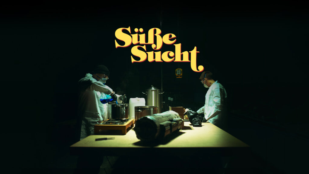
Süße Sucht
Sugar is everywhere. That is exactly what makes it so easy to underestimate.
“Süße Sucht” is an artistic awareness film that challenges the normality of everyday sugar consumption through a darker and more provocative visual language. Created as my bachelor project, the film received a grade of 1.0 and was awarded best bachelor project of its intake at IU International University, Campus Düsseldorf.
The Idea
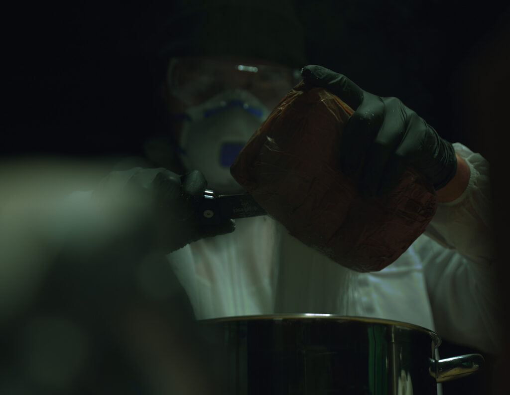
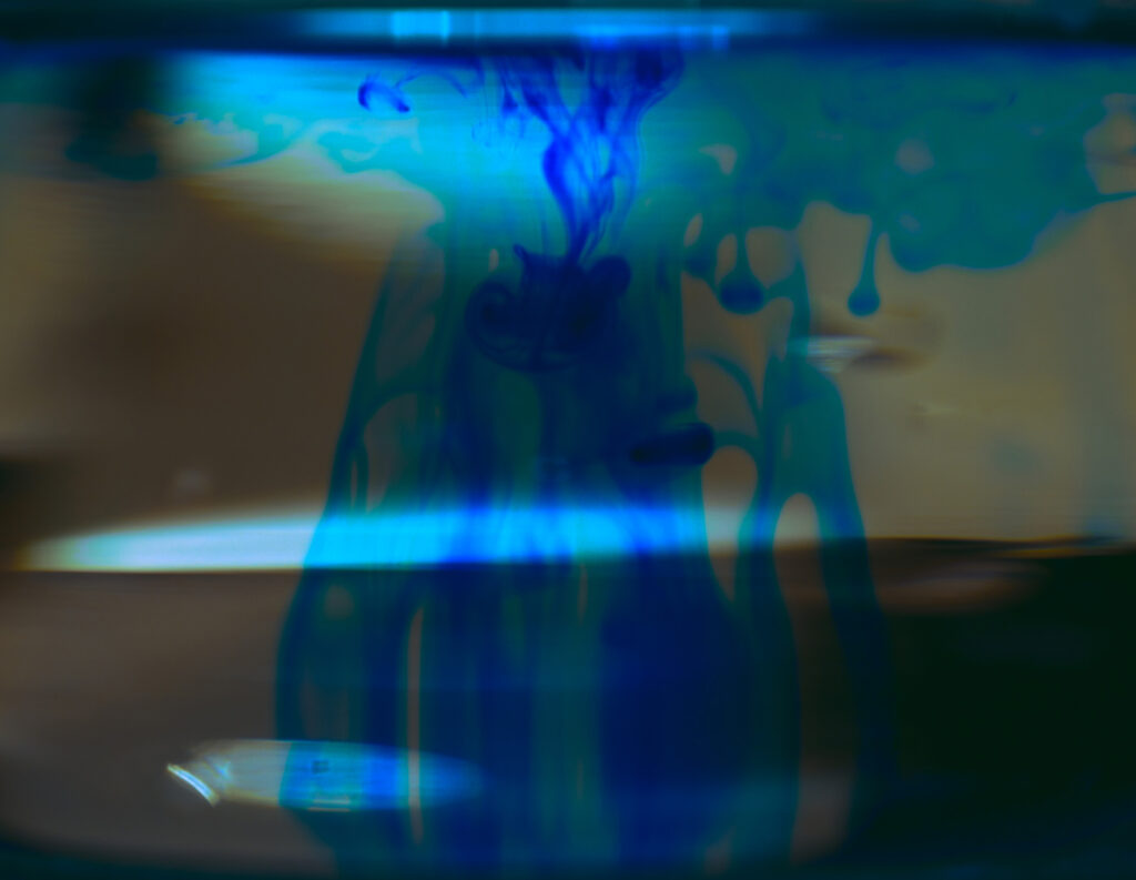
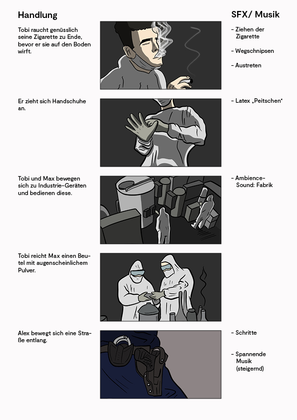
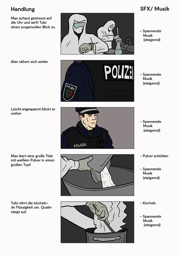
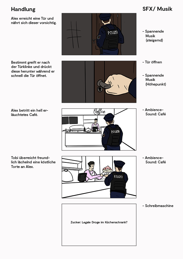
The core idea was simple: if sugar can behave like an addictive substance, show it like one. The film borrows the visual codes of crime stories, illegal laboratories and drug production to create a deliberately misleading setup. By placing sugar in this darker context, the film turns something familiar into something unsettling and makes the hidden danger more visible.
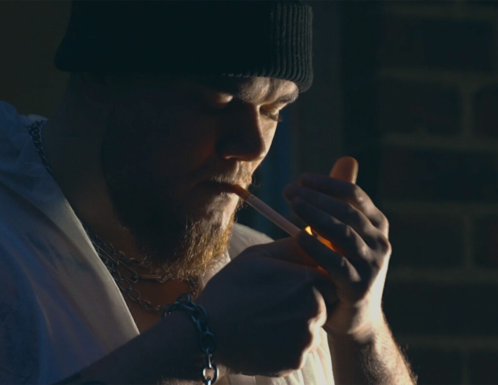
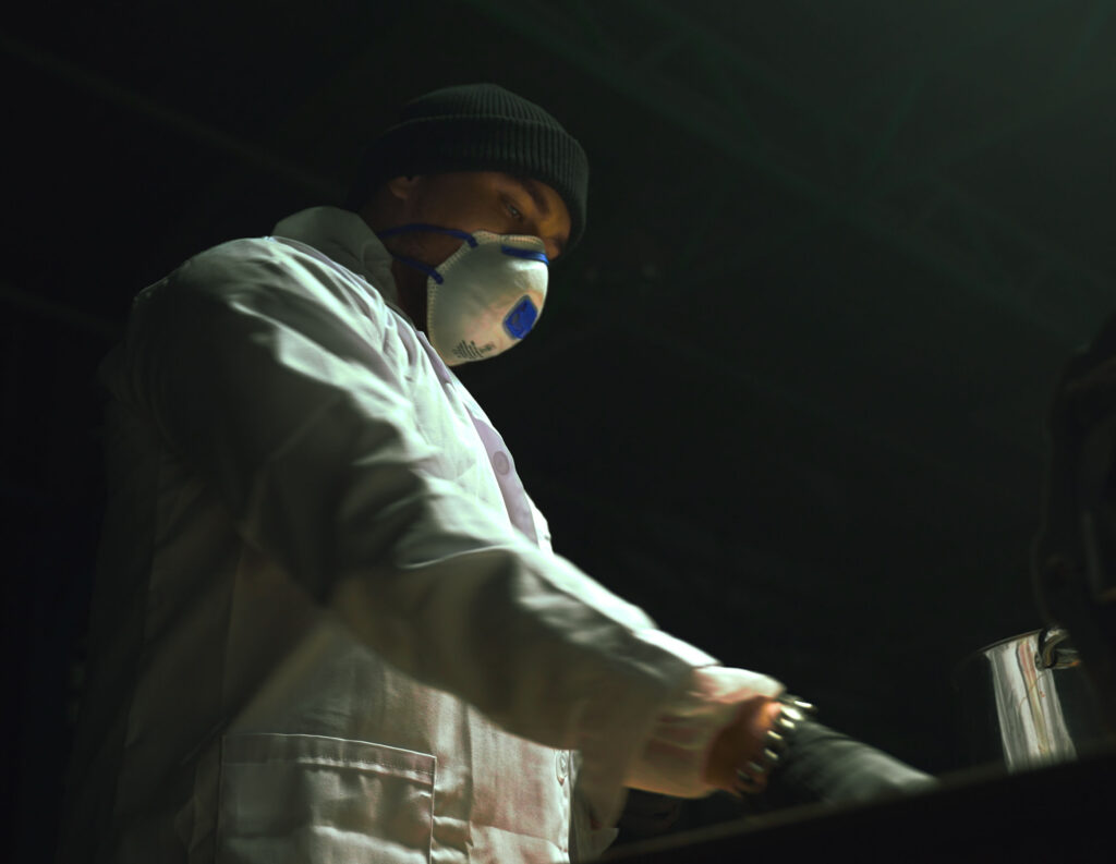
Visual Direction & Production
Visually, the film works with contrast: something everyday is shown through the lens of something forbidden.
Dark lighting, close camera angles, sterile surfaces and controlled movements create a feeling of tension and suspicion. The production was designed to feel cinematic and slightly uncomfortable, using image, rhythm and sound to slowly build pressure. This allowed the film to communicate its message emotionally before explaining it rationally.
The Result
The result is a provocative short film that uses genre, suspense and misdirection to reframe sugar as an underestimated danger. By exaggerating the visual language around illegal substances, the film creates a strong contrast to how harmless sugar usually appears in everyday life.
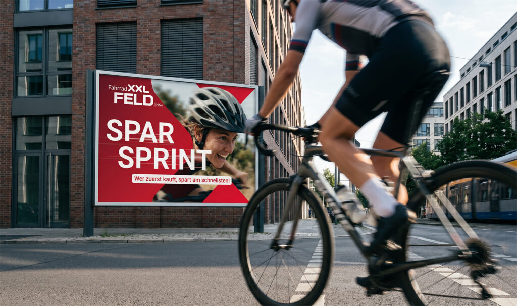
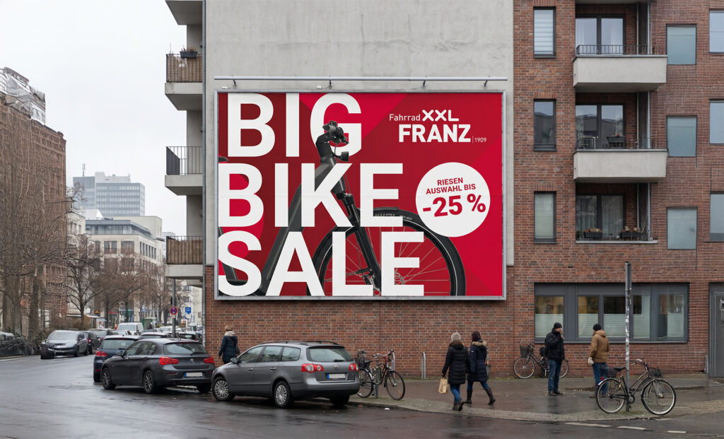
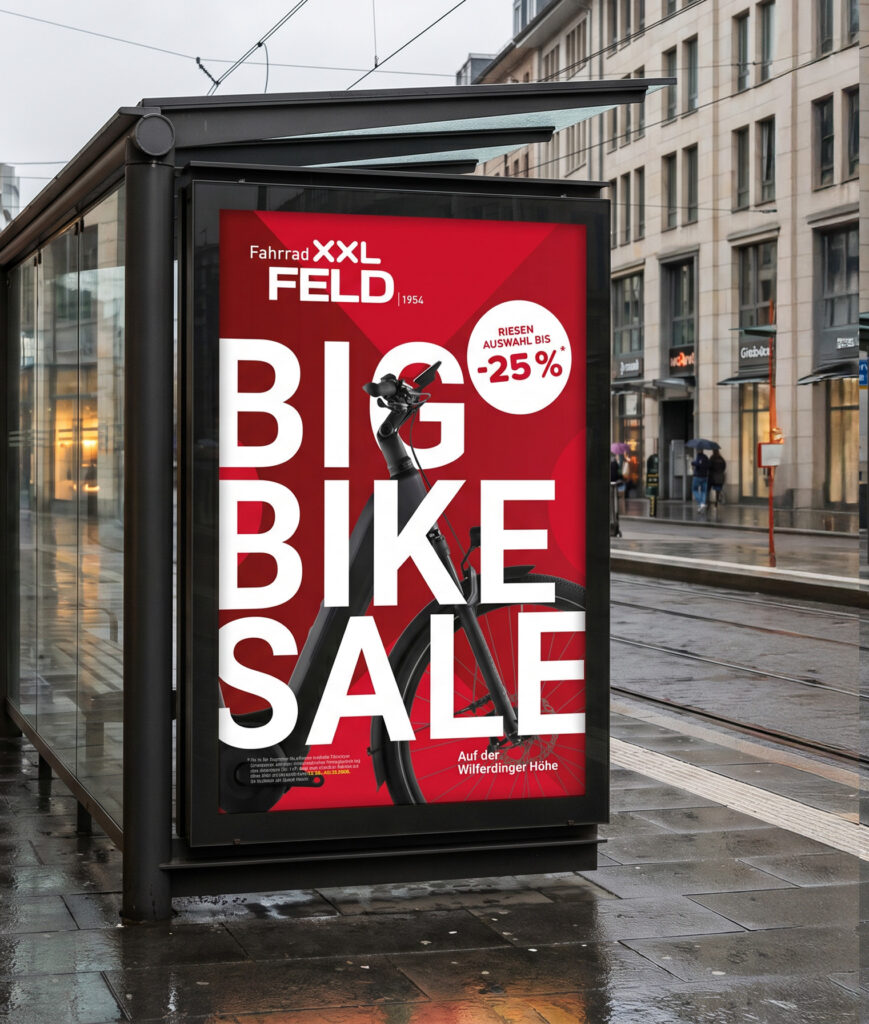
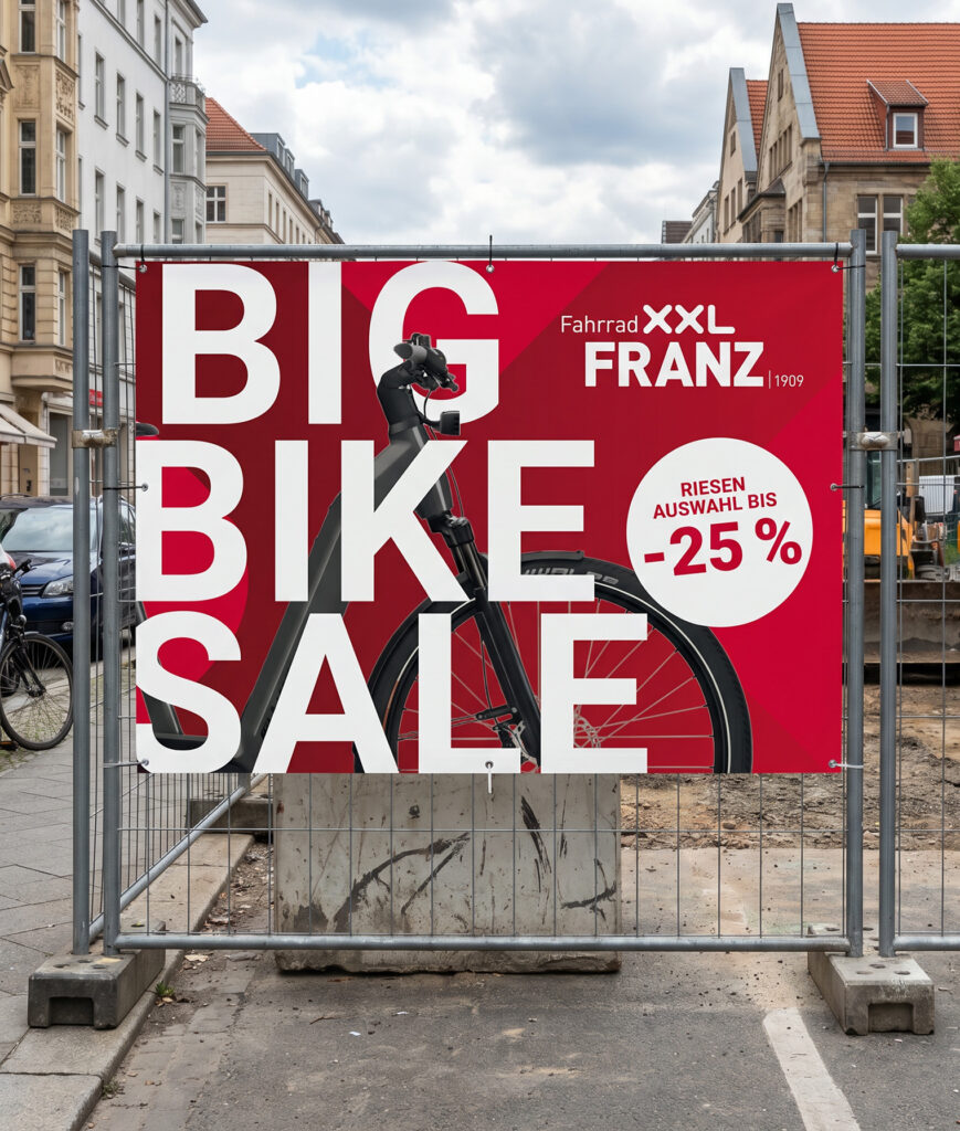
FahrradXXL Campaign Design
FahrradXXL needed a campaign design that felt bolder, more branded and easier to recognise. Built around more X, more red and a clearer visual hierarchy, the new system gives sales communication a stronger FahrradXXL identity.
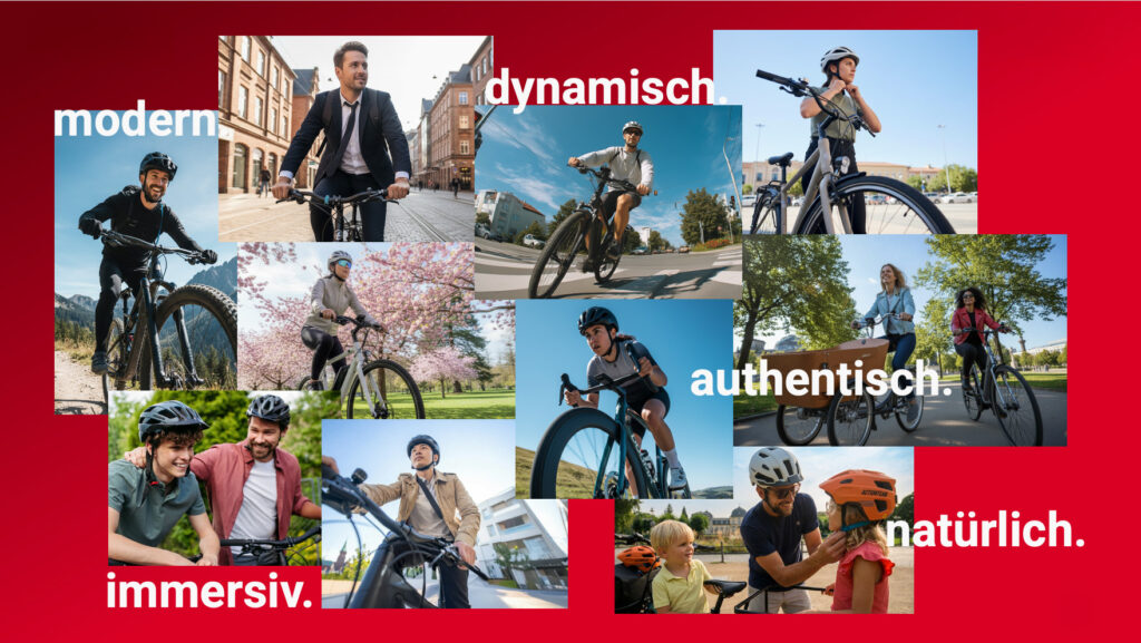
The Image World
The image world was developed to feel more active, more emotional and closer to real cycling moments. Instead of showing bikes in a purely functional way, the visuals focus on movement, lifestyle and the feeling of being out on the road.
This helps the campaign feel less like a price-driven retail message and more like an invitation to ride. The result is a warmer and more engaging visual direction that supports the stronger brand presence.
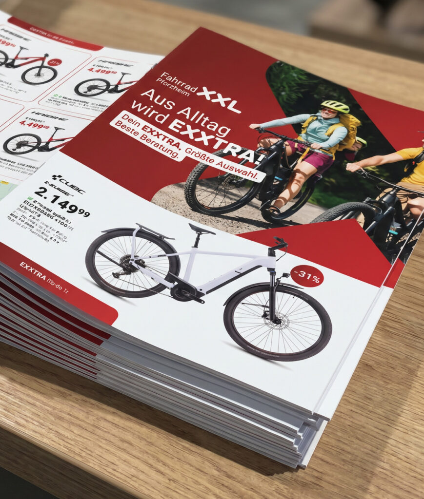
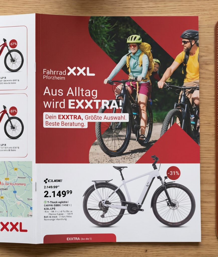
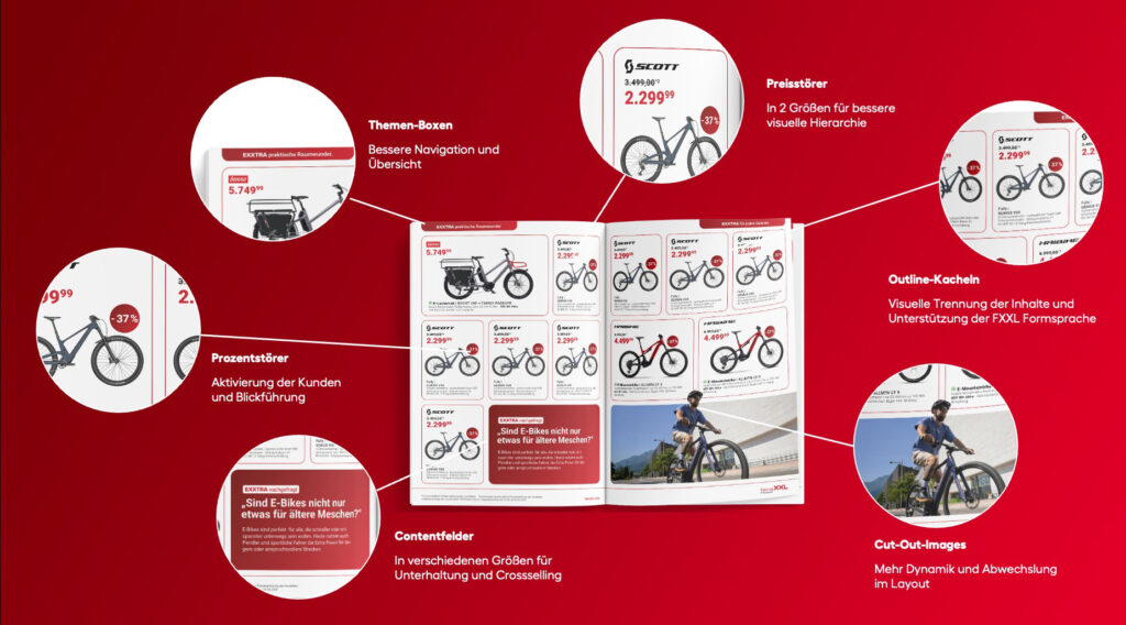
Leaflet Redesign
The Leaflet was redesigned to feel more modern, structured and easier to navigate. Instead of being only a collection of offers, the new layout adds content fields, clearer sections and a stronger editorial rhythm.
This gives the Leaflet more variety and makes it more enjoyable to browse, while still keeping the offers easy to find. A cleaner hierarchy, stronger visual guidance and more branded elements help turn the brochure into a more useful and entertaining retail medium.
The Result:
The new campaign design gives FahrradXXL’s retail communication a stronger and more ownable brand presence. By using the X, red and clearer layout principles more consistently, the system makes sales messages easier to recognise and easier to navigate.
Across OOH and the redesigned Leaflet, the work feels more modern, more structured and more connected to FahrradXXL, while keeping the energy and urgency needed for retail campaigns.
Concept Extensions
As a possible extension of the Big Bike Sale, the campaign could move from classic OOH into a physical city moment: an oversized bike installation that brings the sale idea into public space. Simple, bold and impossible to miss.
better in motion
Mein Showreel
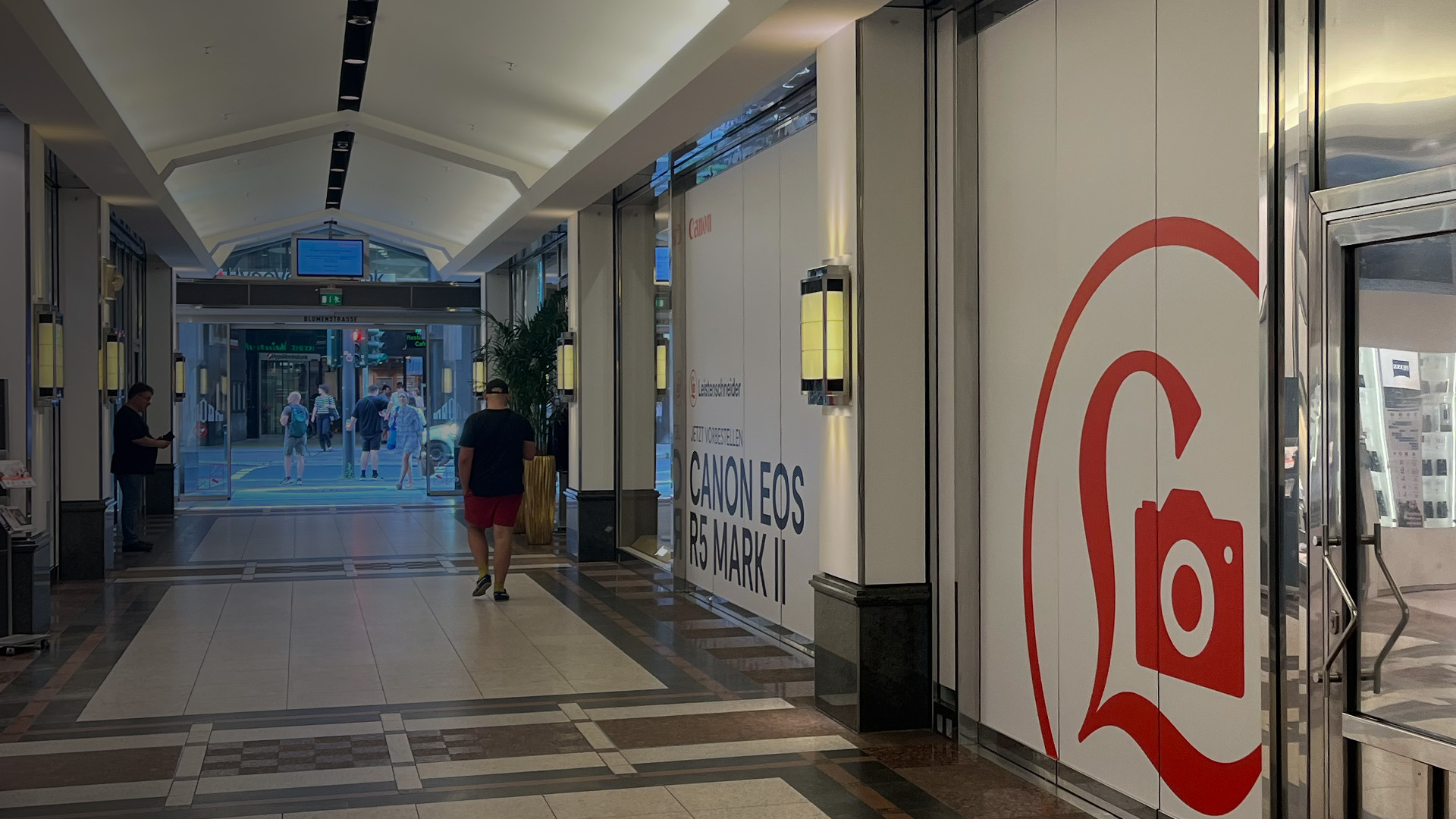
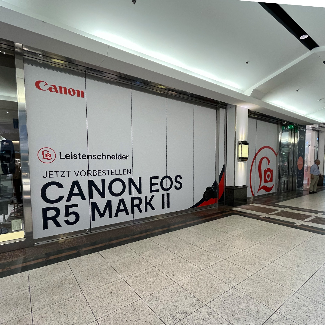
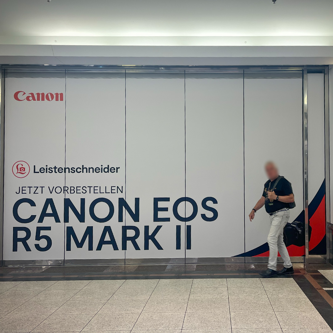
Canon EOS R5 Mark II
8,64 x 3,20 Meter Schaufenster-Beklebung zum Verkaufsstart